Webpage Design Refresh
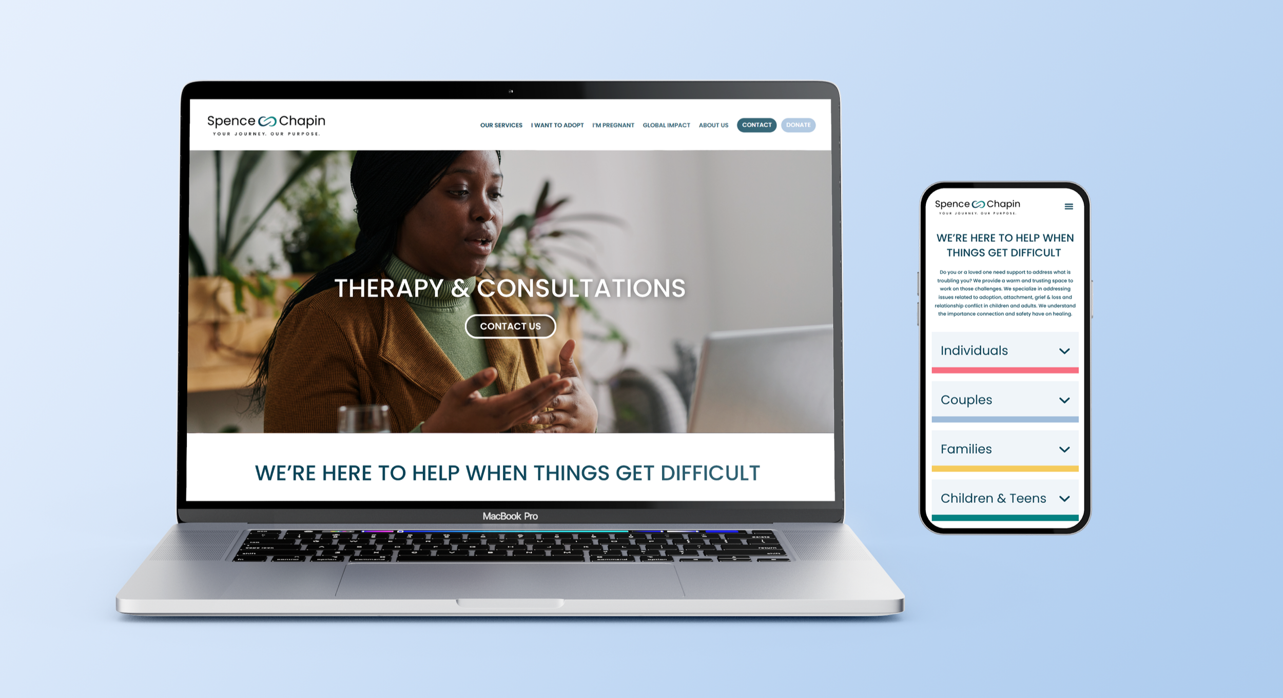
Overview
Following the organization's first major rebrand in more than a decade, the website no longer reflected the new visual identity and brand standards. Content was inconsistent, design patterns varied across more than 80 pages, and the overall experience lacked the consistency needed to effectively support multiple programs and audiences.
Google Analytics data showed more than 70% of users were accessing the site on mobile devices, yet the website had been designed with a largely desktop-first approach. This redesign was an opportunity to modernize the digital experience, align the website with our new brand identity, improve the mobile user experience, and create a scalable foundation for future growth.
The scope of this phase focused on visual design, content presentation, and UI/UX improvements, while a larger information architecture and dual website consolidation project was planned for later in the fiscal year.
Objective
Create a modern, mobile-first website that reflects the organization's rebrand and establishes a scalable framework for future growth. The redesign aimed to increase engagement, streamline the user experience, create clearer calls-to-action, and establish a more consistent experience across the site.
My Role & Responsibilities
I led the website redesign from strategy through implementation, serving as the primary liaison between leadership, designers, and developers.
Research & Planning
Audited existing website content, user experience, and performance.
Analyzed Google Analytics data to understand audience behavior, device usage, and engagement patterns.
Conducted competitive research across nonprofit and mission-driven organizations to identify modern design trends, navigation structures, and user experience best practices.
Researched contemporary UI/UX approaches, accessibility considerations, and content presentation techniques to inform design decisions.
Identified opportunities to improve content organization, calls-to-action, page consistency, and overall user engagement.
Established project goals aligned with organizational priorities, audience needs, and rebranding objectives.
Content Strategy
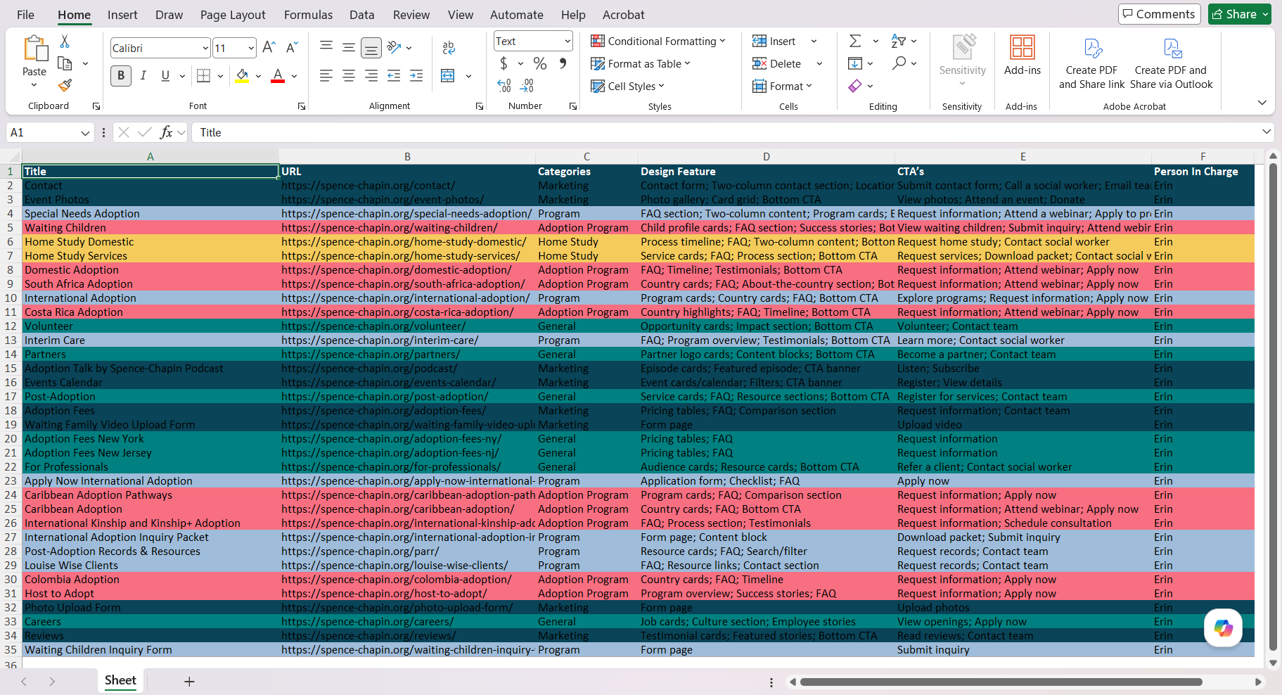
Audited more than 80 website pages and identified common content patterns across programs and services.
Categorized pages by purpose, audience, and content needs to establish a consistent site-wide framework.
Helped define how key messages and conversion opportunities would be surfaced throughout the user journey.
Defined content hierarchy, information presentation, and calls-to-action for each page type.
Design Direction
Partnered closely with designers to translate strategic goals into user-centered page layouts and interactive experiences.
Guided user experience decisions across desktop and mobile environments, balancing audience needs, accessibility, and engagement.
Synthesized content requirements across multiple programs into five flexible page templates, creating a scalable template system that could be consistently replicated across the website.
Helped establish updated typography standards, including H1, H2, and body copy styles aligned with the organization's rebrand.
Development & Implementation
Collaborated with developers over a five-month implementation period.
Provided direction on functionality, usability, design, and interactive elements.
Reviewed builds, tested user experience, and ensured consistency across pages.
Began the implementation of the new design system across priority website pages.
Design Solutions
In partnership with developers, we introduced new functionality designed to improve usability, engagement, and information accessibility, including:
Redesigned hero sections featuring headlines, supporting copy, and clear calls-to-action
Expandable FAQ sections to reduce information overload
Interactive team profile cards
Modular CTA sections that could be reused across multiple page types
Image carousels and enhanced visual storytelling opportunities
Streamlined content layouts with stronger hierarchy
Improved use of white space and visual hierarchy
Mobile-first responsive design improvements
Outcome
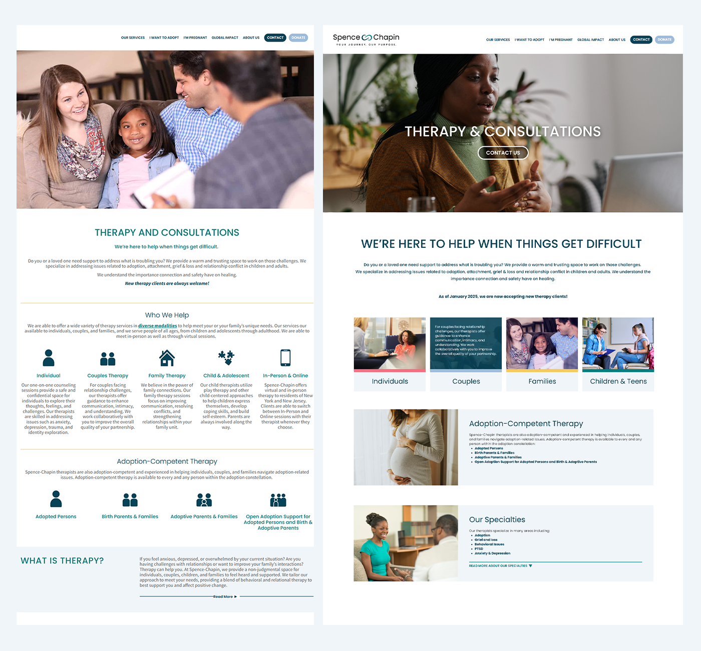
The redesigned webpages delivered a more intuitive and visually cohesive user experience that better reflected the organization's brand and services. Stronger content hierarchy, clearer calls to action, improved mobile usability, and a scalable design system made the site easier to navigate, easier to maintain, and better positioned for future growth.
Platform + Technology Used
Google Analytics — user behavior and performance analysis
Competitor and nonprofit website search — UX and design research
Adobe Creative Suite + Canva — design collaboration and asset development
Monday.com — project management and developer collaboration
WordPress and Elementor — website implementation
